Googlede som en gal efter ny Lydia Davis-tekst, som kunne have være blevet læst op i aftes, men uden held - fandt i stedet to ubrugte omslag til
Can't and Won't ved LD's faste omslagsdesigner Charlotte Strick, begge med køer på:
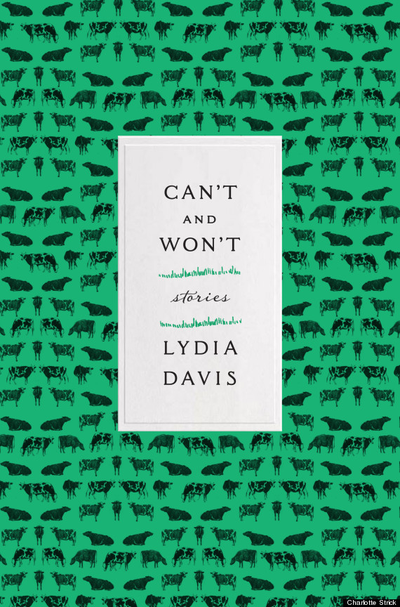
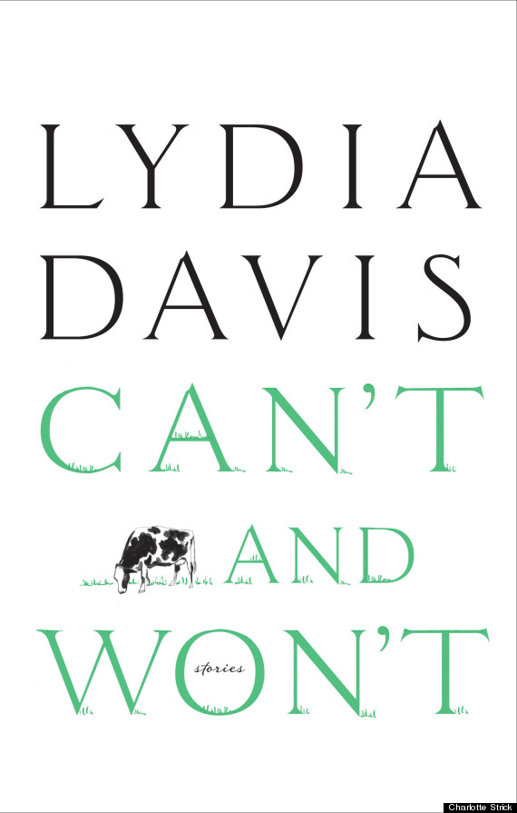
Stricks kommentar:
Ariana (kotegneren LB) and I went through several rounds of cows. At first they all
felt too disengaged and then "not gestural and painterly enough." Lydia
hoped they would be "slightly threatening" while also "curious." We
changed to a 3/4-view and facial expressions that made it clear these
cows weren’t willing to move from their positions on the page, but it
started to feel to everyone like the whole cow idea was too cute and
Lydia’s work is not cute. She had warned me by email that she "might
simply feel in the end that any image of a cow over-determines the way
the book is approached..." Clearly it was time to move on.
These
early sketches look so fussy to me now, though Ariana’s painting style
is simple and sophisticated and the color would be just as limited in
the final jacket design. That "final" design was actually one of my very
first ideas, scribbled in a notepad, but instead of working it out I’d
been seduced by Davis’s bovine neighbors and lost my way. Often you need
to build a jacket design till it’s dense with ideas – then find the
time, will and clarity to strip, strip, strip away. Lydia’s writing is
that stripped down too, and to get a design right for her work I need to
remind myself of this.
At first I was sorry to see these cows amble off my jacket design,
but when I looked back at my computer screen, I saw that what was left
was a blank space and these words:
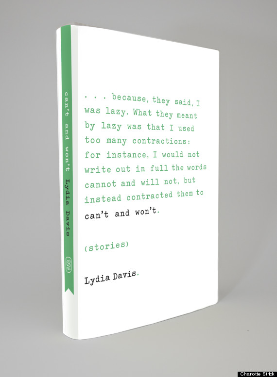
...because, they
said, I was lazy. What they meant by lazy was that I used too many
contractions: for instance, I would not write out in full words cannot
and will not, but instead contracted them to can’t and won’t.
I
had to laugh -- it turns out I’d been pretty stubborn too! Davis’s
sentences hadn’t needed embellishment; they’d just needed me to stop
thinking beyond their simple statement... and for me to find an equally
straightforward way to set them on a page.
Finally, I choose to
deboss all these words to give them another layer of strength. Like the
cows, this book (and its jacket) now quietly stands its ground, daring
you to look away.
- det endelige rent bogstavelige, koløse omslag